
Starbucks
Introduction -
The teams goal is to add key metrics to the My Daily Platform in order to support the Starbucks Partners in understanding their store metrics at a high-level on a platform typical used for internal communication.
As the Lead Product Designer, my goal was to advocate for our Starbucks Partners’ needs by delivering an experience that improves their daily workflow while introducing thoughtful moments of delight and stronger functionality.
Role
Lead Product Designer
Teams
Coffeehouse Decision Center, My Daily, and external metric tools
Skills
Information architecture, Concept design, User interviews, affinity mapping, Wireframing, High fidelity design, Prototypes
Coffeehouse Decision Support
To create a clear and actionable framework for My Daily and Coffeehouse Health by defining the emphasis between primary and supporting metrics, ensuring store snapshots highlight the most impactful indicators while leveraging secondary data for informed decision-making. This approach is grounded in district manager research, affinity mapping, and feedback-driven concept testing to deliver a user-centric, data-driven experience.
Team Objectives

Coffeehouse Decision Support
Team Objective1. Measure: Help Retail Leaders assess and understand the state of operational & financial performance
2. Elevate: Help Retail Leaders know where to focus attention and what to prioritize
3. Execute: Help Retail Leaders plan, create, and communicate initiatives that improve store experience

Coffeehouse Health Page
Page Objective1. The Coffeehouse Action Plan is a foundational tool our Coffeehouse Leaders use to organize action steps to grow the business and close operational gaps identified through data, trends and observations.
2. By moving the Action Plan to a digital format, we unlock the opportunity to improve the planning, creation, sharing and execution of CAPs
• Elevate Opportunities and Insights: Coffeehouse Leaders view key metrics and insights alongside their Action Plans reducing the need to go to 4+ systems to identify focus areas
• Enable communication and alignment: Store Partners and District Managers can view and comment on CAP
• Track progress and execution: Ability to view focus areas across district/area/region and identify when actions are complete (future)
4. Digital Coffeehouse Action Plans empower Store Leaders to chart their own path, drive measurable outcomes, & link existing tools with best practices across stores
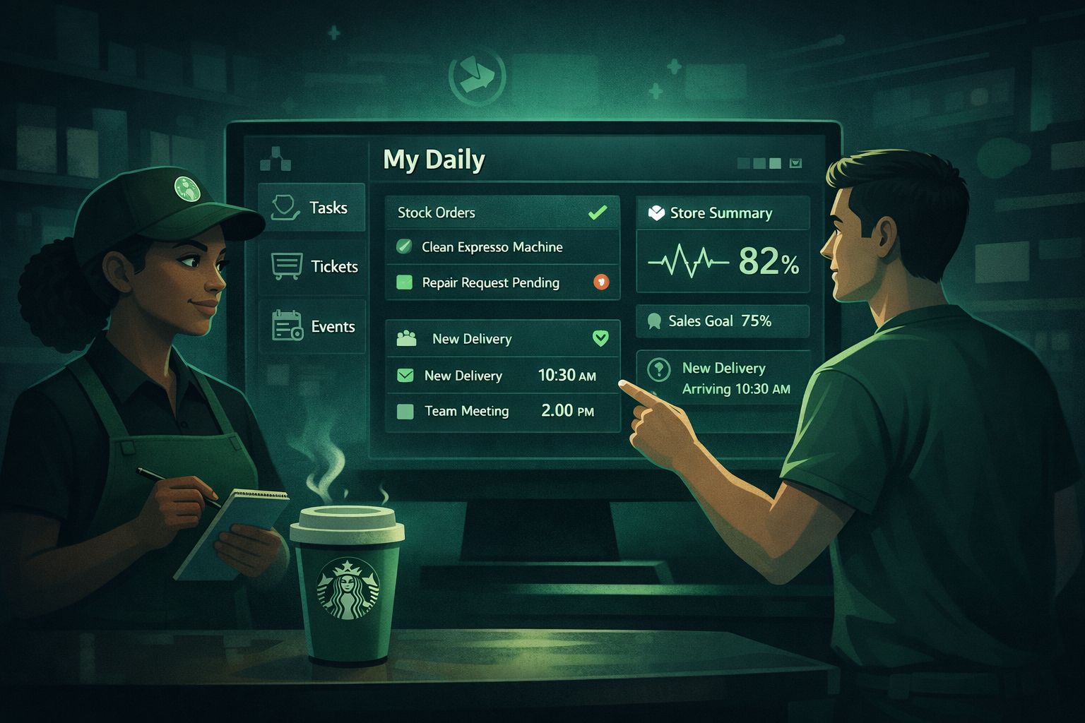
My Daily Home Page
Product Objective1. The My Daily application is intended to provide store partners with a way to navigate their "day in the life" actions in the store experience
2. The My Daily application allows partners to view and manage their tasks and check the status on tickets they reported.
3. Know "the pulse of their store and events happening in their store - at a glance"
Merging Objectives
The Coffeehouse Decision Support team’s goal is to enable Coffeehouse Leaders to assess operational and financial performance, identify priorities, and execute initiatives that enhance the store experience.
Within the Coffeehouse Health Page feature, the team has been able to digitize the Coffeehouse Action Plan, improving:
How leaders plan, create, share, and execute initiatives
Elevate opportunities and insights by surfacing key metrics alongside action plans
Enable communication and alignment through shared visibility and commenting
Lay the foundation for tracking progress across districts and regions to drive measurable outcomes (future thought)
While the Coffeehouse Health Page works as a location for the team's objectives, the My Daily home page also has similar goals to give store partners instant visibility into the pulse of their store: providing a quick, consolidated view of store health and events, while also enabling them to manage daily tasks and track ticket status seamlessly.
Coffeehouse Decision Support complements these projects by giving store partners a clear view of daily tasks and store status, ensuring operational excellence at a glance. Collectively, these projects streamline decision-making, elevate insights, and enhance execution across the organization.
To enhance operational efficiency and deliver a unified experience for coffeehouse leaders, integrating the Coffeehouse Health Page within the My Daily Home Page is the best user experience approach. This integration consolidates daily task management with actionable insights and digital Coffeehouse Action Plans, reducing system fragmentation and improving visibility into store health. Under the Coffeehouse Decision Support framework, this approach ensures that prioritization, planning, and execution are informed by real-time operational and financial data driving alignment and measurable outcomes across all levels of the organization.
Current Information Architecture
First to understand our partners journey in My Daily we need to understand the architecture of our platform.
1 . Hierarchy/Priority: Original discovery approach was conducted to create the coffeehouse health page concept.
2. Excessive Hierarchy: Too many nested categories before reaching the goal.
3. Redundant Pages: Information split unnecessarily across multiple screens.
4. Delayed Goal Visibility: Critical action, ex CAP or SPA priority action, buried deep.
5. High Click Count: To reach the Coffeehouse Health Page requires 5 clicks for users, and additional for further reports and action plans.
Coffeehouse Health Page Concept Feedback Sessions
This research explores the concept of a new Coffeehouse Health Page (CHP) within My Daily — designed to help Coffeehouse Leaders quickly understand their coffeehouse performance, identify gaps, and take action without navigating multiple tools.
Currently, evaluating coffeehouse health is fragmented across multiple sources (Grow, P&L reports, and operational dashboards*).
The CHP aims to centralize critical insights and action planning in one place, streamlining how leaders assess performance and close gaps — providing insight instead of raw data.
The sessions will combine in-depth exploratory interviews with concept evaluation to validate both the intent and design direction for the MVP and target state.
Concept - Original discovery approach was conducted to create the coffeehouse health page concept:
Identify & Align: Select key SMEs in Coffeehouse Excellence and clarify business value.
Gather Insights: Interview SMEs and review existing UX research.
Ideate & Validate: Create initial CHP mockups, validate with SMEs, then refine with SSC leaders and Coffeehouse Ops.
Audience -
8 Feedback sessions were conducted
5 Coffeehouse Leaders, 3 District Managers
Concept designs was adjusted throughout the testing process based on feedback and requirements as they were delivered

Affinity Mapping
After the concept feedback sessions, all user input was systematically organized into overarching themes to identify common patterns. Within each theme, subcategories were developed to provide greater clarity and highlight specific areas of interest. This structured approach enabled a deeper understanding of user perspectives and ensured that insights were actionable. By synthesizing findings from eight sessions, the analysis revealed four key takeaways that represent the most critical opportunities for improving the Coffeehouse Health experience.
Action - Actionable steps are not always clear from metrics alone. Creating next steps takes too much time and business acumen for coffeehouse leaders. Original discovery approach was conducted to create the coffeehouse health page concept:
Trends - Metric trends are critical because they reveal patterns in performance over time, enabling proactive decision-making. High usage of metrics indicates strong engagement and accountability, while understanding their importance ensures leaders prioritize the right data to drive operational improvements and strategic goals.
Value - While users see value in having a dashboard, they don’t perceive it as solving a pain point because existing tools and reports already give them a clear picture of store health.
Cumbersome/Scattered - Users find toggling between multiple platforms and pages, combined with excessive information hidden in icons, to be overwhelming and frustrating.

Current Experience Story Mapping
Once we have the data and key themes from the feedback sessions we can make an informed user story-map. Knowing these themes and structure of our partners we can make a user story map. This can visualize the end to end experience and provide clarity on how users engage with My Daily and their digital metric products. This can highlight opportunities, user goals, and highlight pain points.
1. Objectives
Partners begin the week by reviewing key store metrics and monthly goals, drilling into growth opportunities, and updating Coffeehouse Action Plans to address business gaps. Throughout the week, they monitor metric releases, track progress, and collaborate with their District Manager to ensure alignment and sustained growth.

2. Tasks
Users currently open multiple applications to gather key metrics. They review past periods and Coffeehouse Action Plan focus areas to identify trends and growth opportunities, then turn these insights into actionable weekly goals that improve store performance and align with business objectives. Regular reporting and discussions with District Managers ensure accountability and alignment, while reliance on later-week metric releases delays decision-making and often requires revisiting plans mid-week.

3. Metrics - Key Metrics
Sales, TSD, Inventory, Customer Experience, GROW, OTW, Tuesday Report Updates, GROW Report Updates, Loss Prevention – Negative Sales, Service Recovery. Platforms: Decision Center, My Daily, IMS, Observation, S4

4. Goals
Partners seek to start the week fully prepared by accessing all necessary tools and understanding store performance after the previous period. Their goals include identifying red flags, aligning with current priorities, and using trends and targeted goals to make data-driven decisions. They aim to translate insights into actionable tasks that drive improvement, foster alignment across store roles, and maintain transparency through regular updates with District Managers. Ultimately, they strive to stay informed with the most up-to-date metrics to ensure progress toward weekly and monthly objectives.

5.Pain Points
The current experience overwhelms users with too many reports, excessive details, and delayed updates, making it hard to identify actionable insights quickly. Users spend significant time switching between tools and interpreting data instead of focusing on improvement. To address this, the product should follow two key principles: Right information, right time—deliver only the most relevant insights when they matter, reducing noise and adapting dynamically to context; and Design the path, reduce the fog—guide users through clear, intuitive workflows that surface prioritized actions and eliminate guesswork. This approach will streamline decision-making, reduce cognitive load, and create a more efficient, confidence-building experience.

6.Opportunities
To improve the user experience, the dashboard should streamline access to key metrics by consolidating data into a single, intuitive view, eliminating the need to switch between multiple tools. It should surface actionable insights by highlighting priority areas and recommended actions based on trends and store goals, reducing guesswork and enabling confident decision-making. The experience must embrace contextual relevance, dynamically adjusting what information is shown based on timing, user role, and current priorities—delivering the right information at the right time. Additionally, the design should guide users through clear workflows, grouping related tasks logically and providing intuitive navigation to reduce the fog and make the path forward obvious. Finally, simplifying tooltips, minimizing unnecessary details, and prioritizing clarity will reduce cognitive load, allowing users to focus on outcomes rather than interpretation.
Future Experience Story Map
The future experience story map will illustrate a streamlined, intuitive journey where partners and leaders engage with a unified Coffeehouse Health Page. This map will visualize how users seamlessly access real-time metrics, update assessments, and take action without navigating multiple tools. It will highlight the improved flow of information, guided workflows, and dynamic insights that enable confident decision-making. By focusing on clarity, efficiency, and role-based relevance, the story map will showcase how the redesigned experience supports proactive planning, collaboration, and sustained growth across all levels of the organization.Partners start the week with a consolidated dashboard that provides a clear snapshot of store health, including key metrics, rankings, and priority actions at a high level. Instead of navigating several platforms, they can immediately identify trends, red flags, and recommended next steps tailored to their goals. Throughout the week, real-time updates keep progress visible, while integrated workflows make adjusting plans simple and efficient. Collaboration with District Managers is strengthened through shared visibility and streamlined communication, allowing partners to focus on driving improvements rather than interpreting data.
Potential - Future Information Architecture
Bridging the GapAction - Displaying metrics alongside assessments and action plans to show correlations and reduce the time required to apply business acumen when creating a plan
Direct - Provide key insights and high-level assessment overviews on the homepage so users can immediately understand priorities and take action without navigating through multiple layers.
Immediate Context: Users see the most important information at a glance without digging through multiple pages.
Faster Decision-Making: High-level summaries reduce cognitive load and help leaders prioritize actions quickly.
Improved Engagement: A clear snapshot of assessments encourages users to explore details when needed.
Efficiency: Cuts down navigation time by surfacing critical insights upfront.
Strategic Alignment: Keeps everyone focused on top priorities and overall performance trends.

Wireframes
Design Exploration
To integrate Coffeehouse Health metrics better into the My Daily experience, I explored the My Daily Home Page Design. Each option balances partner workflows, information clarity, and platform usability while addressing the goal of giving partners a quick pulse of their store. My main goal with these wireframes were to enhance the My Daily Home Page for our Starbucks Partners. And to create a business strategic plan to implement these changes, and not cause to much additional mental load for our Partners by deploying a entire Home Page redesign of content and style. Information Prioritization
Surface critical updates first to support partner decision-making.
Recognize that coffeehouse health metrics update less frequently and avoid homepage clutter.
Deliver the right information in the right place at the right time.
Actionable Insights
Ensure metrics are clear, meaningful, and actionable.
Use trend visibility to help partners identify patterns and root causes.
Connect metrics to existing My Daily tools and workflows.
Design Approach
Follow existing My Daily design patterns while refining and modernizing the experience.
Use purposeful color, clear labels, and effective chart types to tell the data story.
Place key metrics where users naturally scan and group related information logically.
Include interactive elements and clear calls to action linking to deeper insights.
Current State
In productionThe current home page uses a simple two-column layout that largely mirrors the features already accessible through the navigation. While the team has been eager to evolve this page, it also functions as a familiar daily touchpoint for our Partners, making thoughtful changes especially important.
Version One
WireframeBy introducing a Health Metrics section using the same layout and pattern as the current home page, Partners can become familiar with its location and usage before larger structural changes are introduced. This layout also emphasizes a metric hierarchy that is a balance between business value and frequency renewed.
Version Two
Ideal future designThis secondary wireframe explores a reimagined My Daily homepage that eliminates duplicated navigation content and instead surfaces a high-level view of store health alongside daily operational tasks. By strengthening the information hierarchy and organizing content into more actionable sections, the experience helps Starbucks Partners quickly prioritize their work while offering a ‘behind-the-scenes’ look at overall store performance.
Coffeehouse Health Page Progression
Current State
The original Coffeehouse Health Page relied on an embedded dashboard from the third-party analytics platform Tableau. This approach mirrored Starbucks Partners’ existing method for accessing and analyzing coffeehouse data in real time, presenting metrics in a familiar table-based format pulled directly from the analytics system.
Tableau metric table Business Emphasis Design
As Starbucks evolved its reporting strategy, one of the key indicators of store health transitioned from Tableau to the GROW Report. To support this shift, I collaborated with business subject matter experts and coffeehouse analysts to identify a high-level set of key metrics that best represent overall store performance. This phase focused on aligning the design with updated business priorities and consolidating the most critical metrics into a single integrated view.
Integrated Metrics Actionable DashboardUser Centered Design
In the final phase, I combined the business requirements with additional user research and testing to better understand what Partners needed from this space. The design evolved into a more actionable dashboard, prioritizing clarity, usability, and quick decision-making. Metrics were organized to be easier to scan and interpret, creating a cleaner experience that helps Partners quickly understand store health and take the appropriate next steps.

Next Steps
Socialize the Design
Share the wireframe with the team and all project stakeholders to gather alignment and early feedback.
Validate the Concept
User Feedback: Conduct quick usability testing or stakeholder reviews to confirm the layout and flow meet user needs.
Iterate: Make adjustments based on feedback before investing in higher fidelity.
Unified Apps
Before finalizing any design decisions, our team will collaborate with the Unified Apps project to understand integration points, shared functionality, and potential dependencies. This alignment ensures that our design remains consistent, scalable, and compatible with their approach, preventing rework and maintaining a seamless user experience across platforms.
Test Navigation: Validate that users can complete tasks easily.
Finalize Detail
Incorporate more structure, spacing, and basic visual hierarchy.
Content Placement: Add placeholder text and images to simulate real content.
Handoff to Development
Prepare design specs, assets, and documentation for engineers.